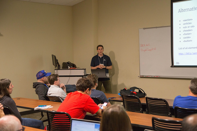
This weekend I had the privilege to present a session at DrupalCamp Asheville: Common Accessibility Mistakes and How to Avoid Them. It was a lot of fun, and my first time presenting my own session at a web development conference!
I discussed four of my own homegrown principles for developing accessible websites:
- Web Design is more than graphic design
- Be ASAP: As Semantic As Possible
- Websites should look good naked
- Talk to your computer (Use ARIA attributes)
I also covered 10 common accessibility mistakes that I come across (and that I've personally made).
I've uploaded the slides to Notist and Slideshare.
Best of all, the recording is on YouTube already, I've embedded it below:
I was really nervous no one was going to show up or that I was going to choke big time, but it turned out way better than I ever imagined it would. The turnout was great, the room was packed, and I got some really great feedback, both in person and on Twitter after the fact:
You bet Bro! That was awesome. Clear. Clean. Smart. And truly tested for the full UX of this work — really well done,... (My team will study your strategies when I get home - #ThankYou)
— James Smith (@jmosmith) July 14, 2018
Some really good questions came up that I need to find answers to:
- Is there a recommended screen reader for Linux?
- How do you handle alt text and descriptions for complex interactive graphs and figures?
And finally, here's the original submission description for the presentation:
For some, accessibility conjures nightmares of garish focus rings and high-contrast fonts. For others, it's snooze-inducing checklists ad nauseam.With the onerous checklists and guidelines and complicated wording, accessibility can seem like a chore that takes a beautiful design and makes it...less beautiful. But accessible web design really boils down to a few basic principles and when you have these as your first principles when starting a project, you can save your self, your team, and your clients hours of headaches around accessibility testing.
This presentation will describe a few basic principles to keep in mind when building accessible web experiences, provide explanations and examples of these principles in code, and identify common accessibility pitfalls and how to avoid them.
Topics to be covered:
- Simple JavaScript techniques for ensuring accessible components
- CSS properties that affect accessibility
- How to use modern CSS (flexbox, grid) without compromising accessibility
Attendees will leave with:
A mental framework for building accessible web experiences. The ability to avoid common accessibility pitfalls. JS and CSS code samples to use in future projects.
Working on the presentation has kept me really busy the past few months, but now I should have some time to work some of my ideas from the talk into blog posts here. Some of it will also probably get used in a Mediacurrent webinar I'll be co-hosting in August - stay tuned for more details.
