When I was entering the front end developer ranks, no one talked to me about accessibility. I didn't know you could break the law for having an inaccessible website, until one day a university client came to my team to help them perform an accessibility audit. Man was I in over my head.
I started digging in and doing research, but found a lot of the documentation intimidating. Some of it was over my head, and there was so much to digest, but I eventually made my way through. (Well, I'm actually still making my way through).
I've since learned that accessibility doesn't have to be intimidating, and can even be fun.
What would have helped me at the beginning were a few practical principles to help me grasp the basics.
So let me share with you:
Ben's Homegrown Web Accessibility Principles
They're not rules.
They are mental shifts that I had to make when I started developing accessible websites.
Let's get into it.
Principle 1: Web Design is more than Graphic Design
When I started my first web job, I was handed a picture of a website and asked to turn it into a website.
After I did that, the designers then meticulously compared my website to their picture of a website and told me all the mistakes I made.
Line height should be 18px, not 16.
This gray is the wrong light gray. It should be light-light gray.
The box-shadow blur is off by a pixel.
Stuff like that. They were very impressive and I learned a ton.
But none of us really considered that the web is not a controlled medium. We were so concerned with the visual elements of the work, that we didn't consider how the site might perform on a $99 Android phone over 3G or for someone who was color blind, or someone who couldn't see at all.
And the fact that the web can be accessed by these people in those situations is what makes web design so much more than graphic design.
So instead of focusing merely on visual elements, I split my work into three main tasks.
Three Tasks of Web Design
Task 1: Write good (read: semantic) markup.
The first task is to write good markup.
This means organizing the content on the page well. Using HTML the way is was meant to be used. HTML is accessible by default. So if we get this right from the beginning our jobs are so much easier. We'll spend some more time on this a little later.
Task 2: Enhance the markup with CSS.
The second task is to use CSS to enhance the excellent markup that we have written.
CSS should be used to emphasize the meaning of your content. It should make it more meaningful, more impactful. But you've got to use the right HTML to begin with or else your job will be a lot harder.
Task 3: Layer interactivity on your HTML and CSS with JavaScript
And the third task is to layer interactivity over the structure and style with JavaScript.
Before and After
The difference between this approach and how I used to build websites is that I used to just reach for the element that was easiest to style, and use that.
I need big text, so I'll use an h1.
I have a complicated accordion interface, so I'll use a bunch of divs
Stuff like that. But that only focuses on the visual aspects. To build accessible websites, we need to think about more than just how closely the site matches the picture. It's more than visual design or graphic design. That's why we call it web design.
This brings us to principle 2.
Principle 2: Be ASAP: As Semantic as Possible.
Here's how I recommend doing this.
Every time you start typing <div>...
Stop.
Look in the mirror.
And ask yourself.
Could I use a more semantic element?
How do you know if there is a more semantic element to use?
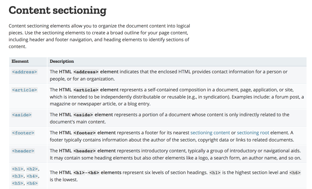
The Mozilla Development Network has a page of all HTML elements organized by their purpose. (This reference is awesome - use it!)

Let's look at some of the semantic alternatives we have for <div>s.
Alternatives to <div>
If you have a stand alone section of a page, consider using the <section> tag.
If you have a blog, news article, forum post, or any kind of self-contained piece of content, you could use an <article>.
Got several components of the same kind next to each other? Consider using an ordered or unordered list (<ul> or <ol>).
Got a top section on your blog post with title and metadata? Use a <header>. Got a bottom section with tags and such? Use a <footer>.
Got a sidebar? Use an <aside>!
Got something that needs to be clickable - use a <button>. This one is important. If it needs to be clickable and is not a link, you should probably use a button.
Let me repeat that: If it needs to be clickable and is not a link, you should probably use a button. We'll talk more about that later.
Just remember: Be ASAP. As semantic as possible.
Principle 3: Web Sites Should Look Good Naked
What I mean by this is that if you remove all the CSS from your page, your website should still be readable and usable.
This principle is really driving home the point of principle 2 ASAP.
Think about it like this: if your markup is semantic, then you are using elements that convey meaning. And that means the browser will provide affordances and signifiers for the meaning and / or functionality of your markup.
So the "naked test" is really a test of how semantic your markup is.
Your markup should look like a well-structured outline, like we used to make in school for research papers.
How do you check this?
Here is the code. If you pop this into your dev tools console, it will strip out everything from the <head> of your document, including the styles.
document.head.parentNode.removeChild(document.head);
What it's doing is targeting the document head and then removing all its children.
Most of the time, I use this as a little bookmarklet in my browser.
javascript:(function() {
   document.head.parentNode.removeChild(document.head);
})();
To use this as a bookmarklet, add a new bookmark in your browser. In the url field, copy and paste the code above instead of a URL. Now, you can click this bookmark while on any site and it will remove all the styles from the document head.
Let's look at an example of this in action.
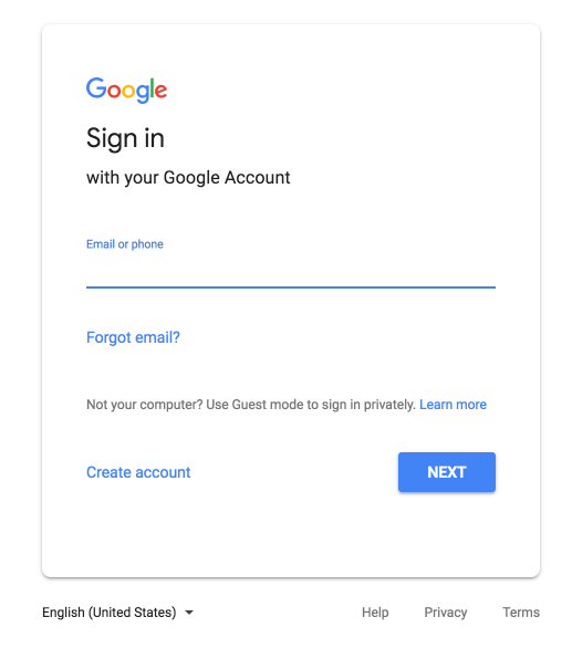
The Google Sign-in form
I think everyone is likely familiar with the Google sign-in form. It's got a title, the email input, and a couple buttons for Forgot Email, Create Account, and Next.

So what happens when we look at it naked?
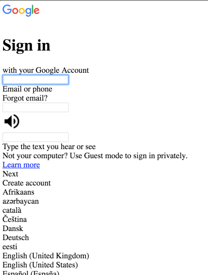
Naked Google Sign-in form

After we remove the styles, we still have the nice Sign in heading, so we know what this page is about.
We have a few inputs, but the labels aren't exactly clear.
And...where did our buttons go?
If you look closely, you can see that what used to be the "Next" and "Forgot Email" and "Create Account" buttons now all appear to be normal text.
We've got three inputs now, instead of the one we had before and the labels appear to be after them.
The Next and Create Account buttons swapped positions.
So everything is still here, but I'd say the main concern I have is with the buttons not really being buttons. They aren't clear.
And let me just say that just because Google isn't using the HTML <button> element doesn't mean this form is inherently inaccessible, it just means they have to do a lot more work with JavaScript and managing keyboard interactions that the browser would typically do for you.
I typically use the naked test as a gut check for myself. Just because a site fails the Naked Test doesn't mean the site is necessarily inaccessible. You can fail the naked test and still have an accessible website. But the Naked Test will reveal areas where you aren't using semantic markup, and these areas may need special accessibility attention.
What to look for during the Naked Test
Here is what I look for when I run this test.
First, I check to make sure the structure of the site makes sense. Are things in the right order? Does each section have a clear heading with the right level of heading tag?
Next, does the content appear to be organized? Can I skim the page and get an idea of the content as if I were skimming an outline?
Third, I look to see if interactive elements look to be interactive. If I've created a bunch of interactive elements using <div>s, they won't appear interactive. Then I'll know to spend a little more time checking the keyboard functionality of those elements for accessibility.
And lastly, I want to make sure inputs have clear labels.
That about sums up the naked test. To reiterate, the point of the test is to reveal weaknesses in the semantics of your site and point out the areas where you'll need to spend a little more time testing to make sure those components are accessible.
Principle 4: Talk to your computer
Here is my fourth and last homegrown principle: Talk to your computer.
Ok, maybe don't actually talk out loud to your computer. What I mean here is to communicate with your computer - give the browser some context using ARIA attributes.
ARIA Attributes
ARIA stands for Accessible Rich Internet Applications, and there are ARIA states, roles, and properties that tell the browser certain things about your web page, if you choose to use them.
I am suggesting that you use them where appropriate. They won't be visible to users, but they will be used by the browser and by screen-readers to provide a little extra context to users behind the scenes.
Here are some examples:
aria-label
The aria-label attribute can be added as an attribute of an HTML element to tell a screen reader what it is. I use these on links a lot, to provide extra context to screen reader users for where the link is going. The value of aria-label should be a string that describes what the element is.
aria-labelledby
If you want to concatenate several existing text nodes into a single aria-label, you should use aria-labelledby. This attribute will accept one or more ID references to the text nodes you want to use to label the input. Here's an example:
<p id="sample-id">Some Text</p>
<input aria-labelledby="sample-id another-id" value="" />
<p id="another id">That defines this input.</p>
A screen reader will read the input as "Some text that defines this input".
The cool thing about this is that it concatenates the text of all the IDs you pass in. (aria-label does not have this same functionality). There are few examples of why you might want to concatenate labels on the w3 site.
aria-expanded
The aria-expanded attribute tells whether an element is open or closed. You might use this on a hamburger button that controls your main navigation. When the screen reader user focuses on the button with an aria-expanded value of false, the screen reader will say something like "Main Menu, collapsed button" and they will know they can open the menu.
aria-describedby
The aria-describedby attribute points to an element that describes the current element. If you want to add some error text to an input, you might use this.
Here is an example:
<label for="example-input">Email</label>
<input type="email" id="example-input" aria-describedby="email-error" />
<div id="email-error">
	<p>The email address is in an invalid format.</p>
</div>
In this example, on form submit, the text "The email address is in an invalid format." is added dynamically to the div. When the input is focused, this message will be read aloud to screen readers.
aria-live
ARIA-live lets the computer know that an area of the page will be updated later. This is really handy with AJAX stuff. It can have a value of polite, assertive, or off.
ARIA means extra context
Using these attributes, you are giving the browser extra context so it can have a better idea of what functionality a certain element may have and more context to users of screen readers and other assistive technologies.
The Principles: A Refresher
That wraps up my four simple principles.
Just to recap:
- Principle 1 is that web design is more than graphic design.
- Principle 2 is be as semantic as possible.
- Principle 3 is that websites should look good naked.
- Principle 4 is talk to your computer, use ARIA.
By minding these principles, you will be able to avoid a good chunk of the mistakes that are made by using non-semantic code concerned only with appearances.
And, if you want to see how to start putting these into practice, I'm launching a free email course: 9 Common Website Accessibility Mistakes and How to Fix Them. Get access to the course by signing up below!
