Last fall, our dev team wanted to get started with style guides. We had added a new member to the team, and as he was getting up to speed, we realized how lacking our project documentation was. If you've ever been a new developer on a team with weak documentation, you know how confusing it can be to try to familiarize yourself with a dozen projects without documentation.
In deciding on a style guide method, we came up with two main requirements:
- Low Friction The style guide should be easy to find, easy to read, and easy to maintain. Something that fit into our existing development workflow would be awesome. Adding new directories for sample markup and documentation files would not be awesome.
- Platform Agnostic We work in Wordpress, Drupal, and CakePHP most often, and we wanted something that would work the same way across all three platforms. We wanted this to be easily maintainable, and for us that meant keeping the documentation alongside the CSS.
The Basics of Node-KSS
To achieve our goals of a platform agnostic, low-friction style guide, we landed on kss-node, which is itself a Node.js implementation of Knyle Style Sheets (KSS), a Ruby library that:
... provides a methodology for writing maintainable, documented CSS within a team. Specifically, KSS is a documentation specification and styleguide format.
The basic principle is that your style guide is generated via comments you create in your CSS, SCSS, Sass, LESS, etc.
You write some CSS like this:
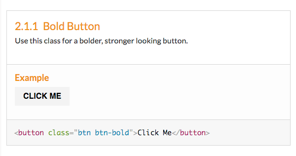
// Bold Button
//
// Use this class for a bolder, stronger looking button.
//
// Markup:
// <button class="btn btn-bold">Click Me</button>
//
// Styleguide Components.Buttons.bold
.btn.btn-bold {
    position: relative;
    font-weight: bold;
    text-transform: uppercase;
}
And get this lovely output:
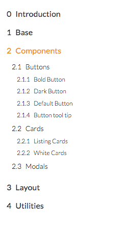
You are able to organize your documentation however you like and it generates a nice little navigation and document structure for you as well:
Because it lives inside your CSS, updating it fits naturally in existing development workflows. If you update some CSS properties, the style guide is automatically updated. If you need to update the documentation, the documentation text is sitting right on top of the component you are working on. Even if you never visit the generated style guide, you will see the style guide any time you open a CSS file. Low friction? Check.
Additionally, since we use CSS and build processes in all our web projects, it's as platform agnostic as we need it to be.
Let's get started!
Initial Setup
In your project directory, you want to install kss-node as a project dependency. We're also going to install michelangelo, a nice theme for the style guide:
npm install --save-dev kss michelangelo
You can verify that it was installed by running
./node_modules/.bin/kss --version
We'll create a file named kss-config.json to configure our KSS settings.
Inside your file, create an object like this (note that my comments below are for reference only, for best results remove them from your config file) :
{
  "title": "Title of the Style Guide",

  // Source tells KSS where the CSS, Sass, or SCSS is that it should parse for documentation comments.
  // Here we are assuming your sass is in a directory at the root level of your project.
  "source": "sass/",

  // Destination tells KSS where to compile your style guide to.
  "destination": "styleguide/",

  // Builder tells KSS where to look for a theme.
  // If you aren't using michelangelo, you don't need this.
  "builder": "node_modules/michelangelo/kss_styleguide/custom-template/",

  // CSS gives KSS the path to your CSS, so it can pull your styles into the style guide.
  // The path needs to be relative to your style guide destination.
  // Here, our style guide is in /styleguide and our compiled css is at our project root.
  "css": [
    "../main.css"
  ],

  // If you want to include any javascript files, add this block, with the path to your javascript file.
  // Also relative to your style guide destination.
 // Optional.
  "js" : [
    "../bundle.js"
  ]
}
This assumes a simple project directory tree that looks like this:
js/
sass/
bundle.js
index.html
main.css
You can try compiling your style guide by running:
./node_modules/.bin/kss --config kss-config.json
If you want a cleaner command to run, add a script to the scripts block in your package.json:
"scripts": {
  "kss": "kss --config kss-config.json"
},
Now you can run $ npm run kss to compile your style guide. (I'll use this method going forward, but you can use $ ./node_modules/.bin/kss --config kss-config.json if you want).
Since we haven't written any documentation yet though, you will likely receive a message like:
Error: No KSS documentation discovered in source files.
Let's fix that by documenting our first component!
Create and Document a Simple Component
We'll create a sample post title component.
Here's our CSS:
.post-title {
  font-size: 3em;
  text-align: center;
  font-family: fantasy;
}
To create our documentation, we'll create a comment:
// Post Title (this will be the title of your component)
//
// Large, **in charge**, and centered. (this is the description of your component. you can use markdown in here.)
//
// Markup (define the markup to be used in your styleguide):
// <h1 class="post-title">A Post Title</h1>
//
// Styleguide Components.article.post-title
// (ꜛ this controls the organization of your style guide. Here, I'm filing this component inside Components / Article / Post Title)

.post-title {
    font-size: 3em;
    text-align: center;
    font-family: fantasy;
}
Run npm run kss and your style guide should compile! You can access it based on the destination path you gave it. In this example, we have a static site and I compiled it in /styleguide, so that's the url I will use to find it. Here's what it should look like if you are using the michelangelo theme (I've removed the comments in parentheses):
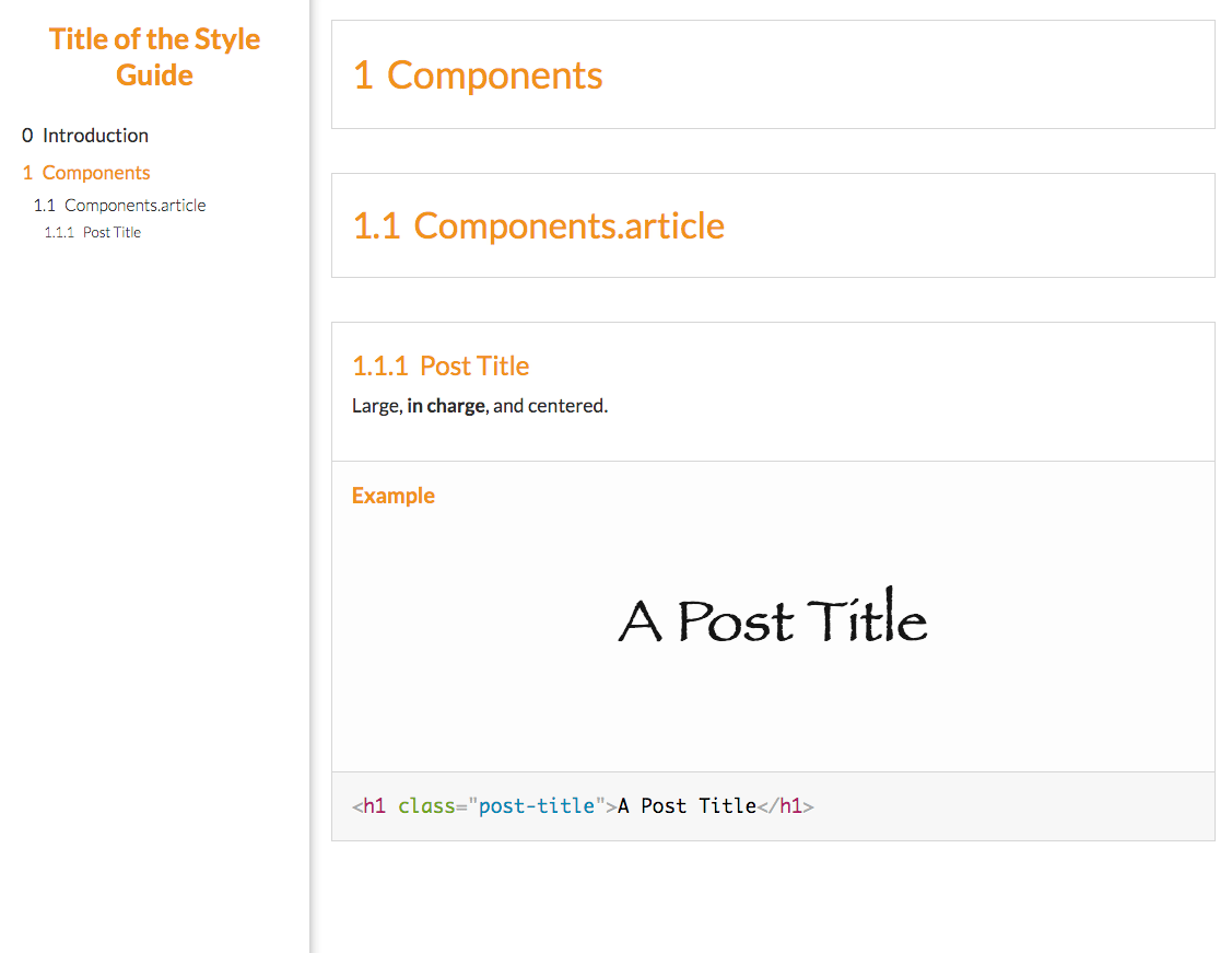
Here's what happened:
- KSS created a documentation section for our post title, complete with the title, description, markup, and CSS that we provided. You can see the rendered HTML and CSS as well as the raw HTML.
- KSS saw that we nested our post title underneath Components / Article, so it created a Components top-level section and a Components.article section. Our post title is nested underneath both of these.
- KSS generated a navigation based on this hierarchy.
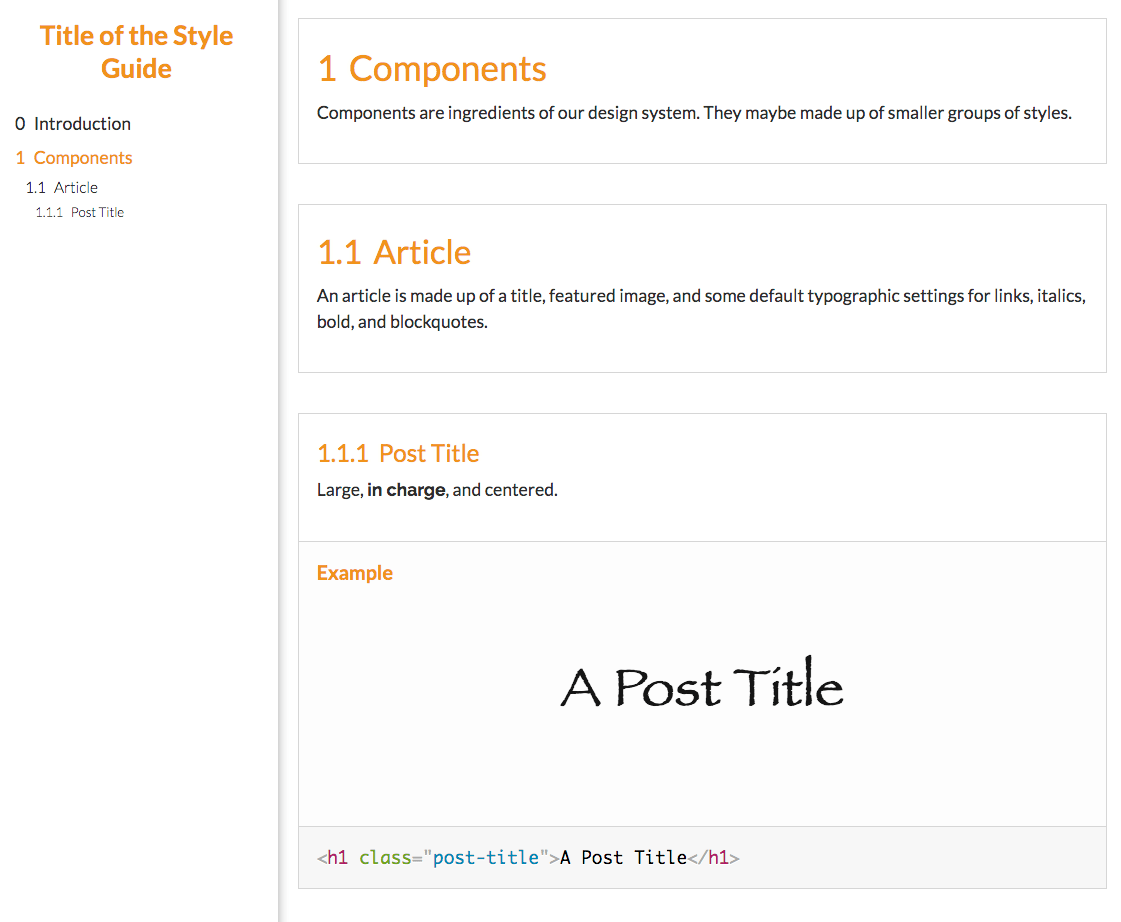
If you wanted to provide more information about Components, you could provide a documentation block (anywhere in your CSS, really) like this:
// Components
//
// Components are ingredients of our design system. They may be made up of smaller groups of styles.
//
// Styleguide Components
Likewise, you could provide more information about the article component by defining a documentation block that targets that item via the Styleguide Components.article method:
// Article
//
// An article is made up of a title, featured image, and some default
// typographic settings for links, italics, bold, and blockquotes.
//
// Styleguide Components.article
With those new documentation blocks, compile your style guide again (npm run kss) and you will see your outline filled out a little more:
Documenting Component States and Variations
Our post title component is very simple, but we'll need to display more complex information in our style guide. KSS can easily handle variations on components as well as interactive states like :hover or :focus. We'll document a button to show this.
Our button will have different styles for :focus and :hover, as well as a small variation and a large variation. Here is the CSS we'll start with:
.button {
  padding: 1em 2em;
  margin: .5em;
  display: inline-block;
  font-size: .9em;
  font-family: Helvetica, sans-serif;
  font-weight: bold;
  text-transform: uppercase;
  color: #f56476;
  background-color: #fff;
  border: 2px solid #f56476;
  transition: .2s color, .2s background-color, .2s border-color;
}

.button:hover {
  color: #fff;
  background-color: #f56476;
}

.button:focus {
  color: #3ddc97;
  border-color: currentColor;
}

.button--small {
  font-size: .5em;
}

.button--large {
  font-size: 1.5em;
}
We'll format our documentation the same as we did for our post title with 2 additions: we're going to add a placeholder class of {{modifier_class}} to all of our elements that will get the modifier, and we'll define our states / variations directly underneath our markup. Our comment block will look like this (I've added some notes in parentheses):
// Buttons (title, same as before)
//
// Various button styles. (description, just as before)
//
// Markup: (we add the `{{modifier_class}}` to every element that has a modifier)
// <a class="button {{modifier_class}}">Link Button</a>
// <button class="button {{modifier_class}}">Button Element</button>
// <input class="button {{modifier_class}}" type="button" value="Input Button" />
//
// (a new modifiers section)
// :hover - When user hovers over button.
// :focus - When button is focused.
// .button--small - A small button.
// .button--large - A large button.
//
// Styleguide Components.button (organization, just as before)
You can see that I've added a variation for each of the variations I declared in my CSS. The format is:
// .class-name - Description
or
// :state - Description
When the styleguide is compiled, you get this new documentation:
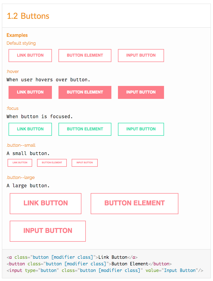
You can see that you now have an example of each of the states and variations that you described in the modifiers section, with the appropriate CSS applied.
This technique also works for more complex components than this button. Say you have a .card component with children elements inside that need to change when a user hovers over the card. To document that, you would add the {{modifier_class}} only to the .card element and specify the hover state just as we did above.
Organization
By default, sections will be organized alphabetically by their title. For instance, our button component will come after our article component in the examples above. However, if you want to change the order of components or other sections, you can provide a weight to the component. A higher weight will bring the component lower in its section. A lower weight will move the component higher in the section.
When using Sass or SCSS, I put my organizational comments inside my main.sass or wherever I am importing my partials. For example, on a recent project, I had a Typography section and Elements section both filed underneath a Base top-level section. Naturally, KSS would organize these sections alphabetically, but I wanted Typography to come first. Here's how I changed the weight in my main.sass file:
// Typography
//
// Weight: 1
//
// Styleguide base.typography
@import "base/typography"

// Elements
//
// Weight: 2
//
// Styleguide base.elements
@import "base/elements"
Color Palettes
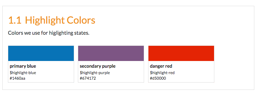
The Michelangelo theme that we are using provides a cool color palette generator. If you are using Sass or SCSS, you can document your color variable names and KSS will format a little color palette block.
With a comment like this:
// Highlight Colors
//
// Colors we use for higlighting states.
//
// $highlight-blue - #1460aa, primary blue
// $highlight-purple - #674172, secondary purple
// $highlight-red - #d50000, danger red
//
// Styleguide Base.colors
KSS will create a color palette for easy reference like this:
Auto Compiling the Style Guide
Instead of running $ npm run kss every time we make a change to the CSS, we can add a watch task to regenerate the style guide every time our CSS files change. I'll document how to do it with npm Scripts and via Grunt next.
npm Scripts
We are already using npm scripts to build the style guide, we just need to add a script that will watch our style guide.
We'll use the onchange package. First install it:
npm install onchange --save-dev
Then add a new script in our scripts object:
"scripts": {
  "watch": "onchange 'sass/**/*.sass' -- npm run kss",
  "kss": "kss --config kss-config.json"
}
The watch task tells onchange to watch the files we specified in our glob pattern ('sass/**/*.sass') and when it detects a change, run the command we specify after the --: npm run kss.
Now running $ npm run watch will watch our .sass files and regenerate our style guide every time it detects a change in our Sass.
Grunt
There is an official Grunt plugin for KSS, grunt-kss. You can configure it to watch your .sass or .scss files for changes and recompile the style guide as you develop it.
Here's a sample Grunt configuration. With this setup, you don't need a separate kss-config.json file, all the configuration can happen in your Gruntfile.
module.exports = function(grunt) {
  grunt.initConfig({
    kss: {
      options: {
        title: 'Title of the Style Guide',
        builder: "./node_modules/michelangelo/kss_styleguide/custom-template/",
        css: [
          "../path/to/compiled/css.css",
        ],
        js: [
          "../path/to/compiled/javascript.js",
        ]
      },
      dist: {
        src: "path/to/css/src",
        dest: "styleguide/",
      }
    },
    watch: {
      sass: {
        files: [
          './path/to/**/*.sass'
        ],
        tasks: ['kss']
      },
    }
  });

  grunt.loadNpmTasks('grunt-kss');
  grunt.loadNpmTasks('grunt-contrib-watch');

  grunt.registerTask('dev', ['kss', 'watch']);
}
Running $ grunt dev will first generate the style guide, and then watch our .sass for changes and regenerate the style guide when it detects a change.
Wrap Up
There are more details regarding the comment parsing and other features I haven't mentioned here at the official KSS repo. You have more than enough to get started here but there are some things I didn't go into, including a custom home page, experimental/deprecation flags and helpers for preprocessors.
If you want to go even further, you can develop your own style guide in place of the Michelangelo theme we used. Check out the docs on using custom templates for more information.
