

I'm working on a client project and needed a simple two-column layout for article pages. Since it's a simple layout, I thought it would be good to try out the new CSS Grid spec, just to familiarize myself with the properties and potential issues that might arise.
Having read Jen Simmons' piece on feature queries, I thought this would be a good time to try out those as well, since I knew the support for Grid was mostly there, but not quite for the Microsoft suite.
The default layout grid features a right sidebar of 300px wide, with a flexible main area. The gutter between them is 20px. On screens up to 991px, the grid collapses. Here's the markup:
<div class="layout-grid">
 <div class="layout-grid-item">
    <p>The man who last claimed the Power Of Gold wished for this world. It reflects his heart. Yes, I came here because of greed for the Golden Power, and look what happened to me... Well, my mind is getting hazy... Please let me hear the sound of the flute one last time. You are perhaps the last one to carry on the blood-line of the Knights... It is ironic that the last one in the line has the potential to become the Hero of legend. If a person who has an evil heart gets the Triforce, a Hero is destined to appear... and he alone must face the person who began the Great Cataclysm. If the evil one destroys the Hero, nothing can save the world from his wicked reign. Only a person of the Knights Of Hyrule, who protected the royalty of Hylia, can become the Hero... May the way of the Hero lead to the Triforce. </p><p>After Agahnim took over, everyone began to act strangely. I suppose it's only a matter of time before I'm affected, too. But what a mischievous thing to leave lying around... The Power Of Gold... Triforce... </p><p>I underestimated that boy. Watch Out! What's your name? ...Link... Strange, it sounds... familiar. Okay, Link... The flow of time is always cruel... its speed seems different for each person, but no one can change it... A thing that does not change with time is a memory of younger days... The Great Deku Tree wants to talk to you! </p>
 </div>
 <div class="layout-grid-item">
     <img src="http://spaceholder.cc/300x200" alt="Random image of space" />
 </div>
</div>
My initial Sass used a float: left column layout and an @supports feature query to test for support of CSS Grid:
.layout-grid

    +bp(large-up)
        overflow: auto
        width: 100%

        & > .layout-grid-item
            float: left
            &:first-of-type
                width: calc(100% - 320px)

            &:nth-of-type(2)
                margin-left: 1em
                width: 300px

        // feature query for browsers that support grid
        @supports(display: grid)
            display: grid
            grid-template-columns: 1fr 300px
            grid-gap: 20px

            & > .layout-grid-item
                width: auto !important
It worked great in the latest Chrome, Firefox, Safari, and even in Internet Explorer 11. I patted myself on the back and moved along with the project. But during QA, I received this foreboding bug report:
On Microsoft Edge, the sidebar menu is all kinds of funky. See attached screenshot.
Checking the screenshot and opening up the page in Edge in Browserstack revealed that the right sidebar was sitting squarely on top of my main content area.
 oh no
oh no
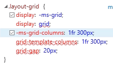
The Edge inspector revealed that my .layout-grid was indeed getting the grid styles, but the grid styles for the old, -ms-prefixed spec.
 ¯\(ツ)/¯
The prefixes are coming from postCSS, so I know why that is getting added. However, I'm still not sure why Edge is detecting that it supports the un-prefixed grid spec. But, in any case, that appears to be what is happening. I decided to throw in the towel and ditch my Grid experiment.
After sleeping on it for a couple days though and listening to the latest Shoptalk Show with Jen Simmons and Rachel Andrews, I realized I might be able to detect support of the prefixed -ms-grid and conditionally apply CSS just to browsers that support the Microsoft spec.
Here's what I ended up with:
.layout-grid

    +bp(large-up)
        overflow: auto
        width: 100%

        & > .layout-grid-item
            float: left
            &:first-of-type
                width: calc(100% - 320px)

            &:nth-of-type(2)
                margin-left: 1em
                width: 300px

        // feature query for browsers that support grid.
        // Microsoft Edge will pick up this query, but not quite sure why
        @supports(display: grid)
            display: grid
            grid-template-columns: 1fr 300px
            grid-gap: 20px

            & > .layout-grid-item
                width: auto !important

        // Override for Microsoft Edge.
        @supports(display: -ms-grid)
            display: block
            & > .layout-grid-item
                float: left
                &:first-of-type
                    width: calc(100% - 320px) !important

                &:nth-of-type(2)
                    margin-left: 1em
                    width: 300px
Bazinga! It works in Edge, IE 11, and Safari, Chrome, and Firefox.