

One thing I had wanted in Storybook for a while was color swatches of all the colors we are using in our project.
We had color swatches in the style tile, but that's a pretty static document and it doesn't really get updated once we start dev, even if colors start to change. Plus, I wanted to be able to display the color variable names we are using along side the hex codes so that hopefully as we discuss colors in the project we can use consistent names.
Really, I wanted something exactly like what Brad Frost has in his site's Pattern Lab:
I only wanted to add this if it was going to be maintainable though. I didn't want us to have to update storybook separately from any color changes we had to make.
Exporting SCSS variables for use in JavaScript
With some searching, I found that you can export variables from SCSS for use in JS with Webpack. In fact, I didn't have to change the Webpack configuration for Storybook at all in order to do this.
Our _colors.scss partial looks like this:
// Defining color variables.
$color-dim-gray: #676767;
$color-zorba: #A19A94;
$color-white-sand: $F1F0ED;
// ... other colors

// Export color variables for use in Webpack.
:export {
  dimGray: $color-dim-gray;
  zorba: $color-zorba;
  whiteSand: $color-white-sand;
  // ... other colors
}
Now that we have the export defined, we can import this object in a JS file, and loop over each color to create a swatch.
// Import colors object.
import colors from './_colors.scss';

const colors = () => {
  return (
    <ul>
      {Object.keys(colors).map((color) => (
        <li>
          <span
            style={
              backgroundColor: colors[color],
              display: 'block',
              height: '4em',
              marginBottom: '0.3em',
              borderRadius: '5px',
              border: '1px solid lightgray'
            }
          />
        <span>{color}</span><br /> // color name
        <span>{colors[color]}</span> <br /> // hex value
      </li>
      )
    )
  )
}
This generates a pretty nice list of colors. A couple things were missing though:
- the color name displays in camelCase, but that's not how we reference the colors when we use them in SCSS.
- the colors are in a single big list, and could be organized better.
Computing color names
Based on the swatch above, we would get output that looks like this:
{swatch color}
dimGray
#676767
What I was aiming for was this:
{swatch color}
Dim Gray (color name)
$color-dim-gray (variable name)
#676767 (actual color variable)
With some help from Stackoverflow, I found a snippet that would help me split the camelcased color name on uppercase letters:
let color = 'dimGray';
color.split(/(?=[A-Z])/);
// returns ['dim', 'Gray'];
This let me do some transformation on the color text.
const colorVariable = (color) => {
	// make an array of the separate words in the color name
  const array = color.split(/(?=[A-Z])/);
  // add a dash in between each word, lowercase everything, and
  // prefix with '$color-'
  return `$color-${array.join('-').toLowerCase()}`;
};

colorVariable('dimGray')
// returns '$color-dim-gray'
I used a similar method to create the color name:
const colorName = (color) => {
  const array = color.split(/(?=[A-Z])/);
  return `${array.join(' ').toLowerCase()}`;
};

colorName('dimGray')
// returns 'dim gray' (I use css to capitalize this in the component)
So that gets me all the values I wanted for each color.
Grouping colors
Another thing I wanted to do was group the colors together. I wanted to display all the neutrals together, all the brand colors together, and the accent colors together.
I found that when you are exporting your values from SCSS, you can nest values in the object:
// Before, without nesting
:export {
  dimGray: $color-dim-gray;
  zorba: $color-zorba;
  whiteSand: $color-white-sand;
  // ... other colors
}

// After, with nesting
:export {
	neutral: {
		dimGray: $color-dim-gray;
	  zorba: $color-zorba;
	  whiteSand: $color-white-sand;
	  // ... other colors
	};
  brand: {
   // brand colors
  };
  accent: {
    // accent colors
	};
}
Now, when you import the colors into JavaScript, each color key will be prefixed with the nested object key name. For instance - dimGray will come in as neutral-dimGray.
This means I need to adjust the methods I created above for parsing the color names. I want to remove the prefix when I display the names, so I need to split on a '-' and grab what comes after the hyphen, like this:
color.split('-')[1]
So my colorVariable function becomes this now:
const colorVariable = (color) => {
  const array = color.split('-')[1].split(/(?=[A-Z])/);
  return `$color-${array.join('-').toLowerCase()}`;
};
And the colorName function is adjusted similarly.
// Convert the color key to the color proper name.
const colorName = (color) => {
  const array = color.split('-')[1].split(/(?=[A-Z])/);
  return `${array.join(' ').toLowerCase()}`;
};
The components
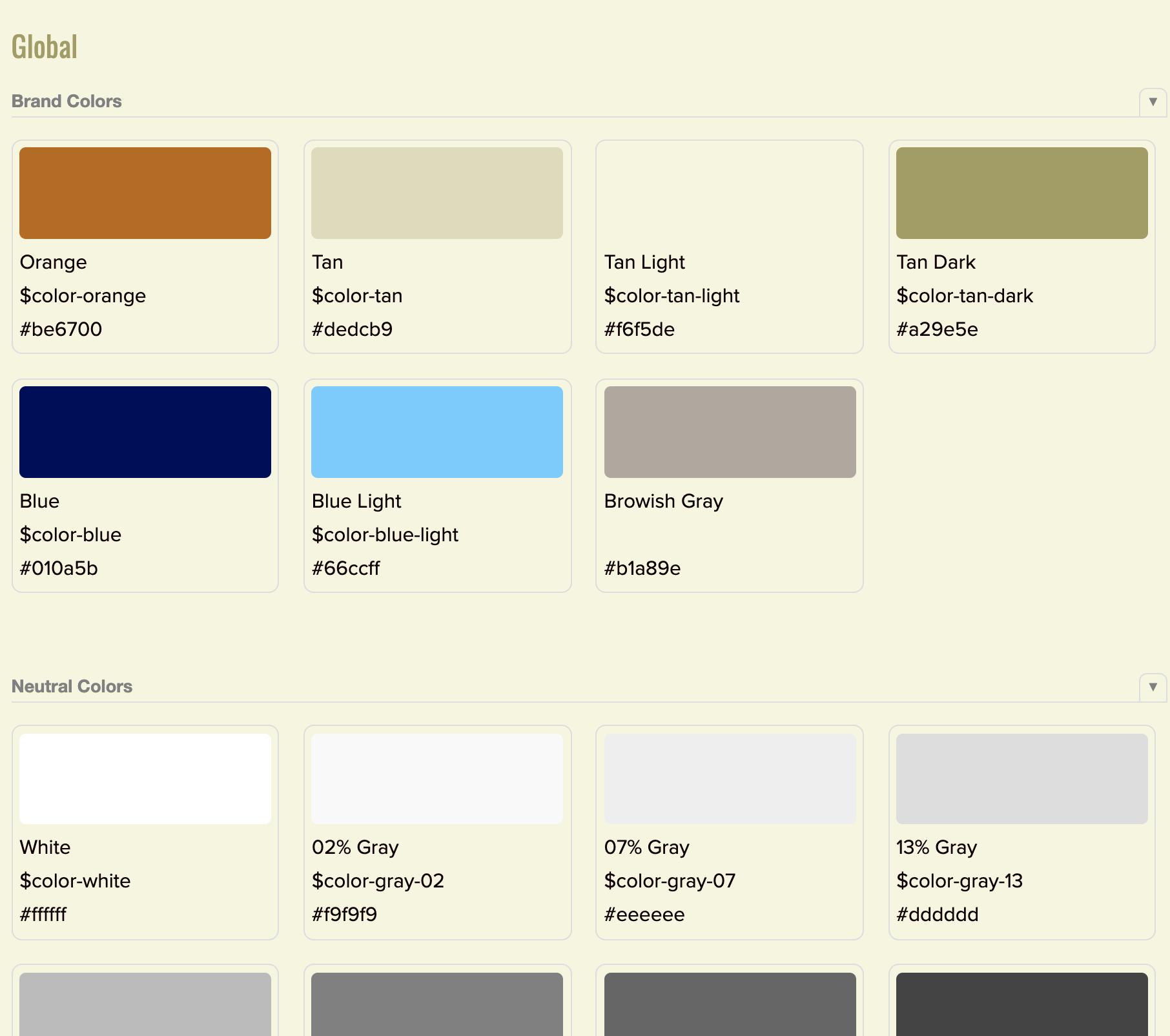
The last step in this was creating the components for rendering in Storybook.
I created a <ColorGroup /> component that displays a collection of <Color /> components.
Here's the display I ended up with in Storybook:
And here's my entire stories.js file for reference on how it all comes together:
import React from 'react';
import PropTypes from 'prop-types';
import { storiesOf } from '@storybook/react';
import colors from './_colors.scss';

const filterGroup = (filter) =>
  Object.keys(colors).filter((color) => color.indexOf(filter) === 0);

storiesOf('Global|Colors', module).add('all', () => (
  <div style={ padding: '20px' }>
    <>
      <h3>Neutral Colors</h3>
      <ColorGroup group={filterGroup('neutral')} />
    </>
    <>
      <h3>Brand Colors</h3>
      <ColorGroup group={filterGroup('pbr')} />
    </>
    <>
      <h3>Accent Colors</h3>
      <ColorGroup group={filterGroup('accent')} />
    </>
  </div>
));

// Convert the color key to the color variable name.
const colorVariable = (color) => {
  const array = color.split('-')[1].split(/(?=[A-Z])/);
  return `$color-${array.join('-').toLowerCase()}`;
};

// Convert the color key to the color proper name.
const colorName = (color) => {
  const array = color.split('-')[1].split(/(?=[A-Z])/);
  return `${array.join(' ').toLowerCase()}`;
};

// A component for displaying individual color swatches.
const Color = ({ color }) => (
  <li
    style={
      borderRadius: '5px',
      border: '1px solid lightgray',
      padding: '5px'
    }
  >
    <span
      style={
        backgroundColor: colors[color],
        display: 'block',
        height: '4em',
        marginBottom: '0.3em',
        borderRadius: '5px',
        border: '1px solid lightgray'
      }
    />
    <span style={{ textTransform: 'capitalize' }}>{colorName(color)}</span>{' '}
    <br />
    <span>{colorVariable(color)}</span> <br />
    <span>{colors[color]}</span> <br />
  </li>
);

Color.propTypes = {
  color: PropTypes.string.isRequired
};

// A component for displaying a group of colors.
const ColorGroup = ({ group }) => (
  <ul
    style={
      display: 'grid',
      gridTemplateColumns: 'repeat(auto-fill, minmax(120px, 175px))',
      gridGap: '20px',
      marginBottom: '40px'
    }
  >
    {group.map((color) => {
      return <Color color={color} key={color} />;
    })}
  </ul>
);

ColorGroup.propTypes = {
  group: PropTypes.array.isRequired
};
I'm thinking about packaging this up as an addon for Storybook. If you would find that useful - let me know either via email or Twitter!