

If you want to have an accessible website you have to make sure it works with screen readers.
What is a screen reader, you ask? A screen reader is a piece of software that reads the contents of a computer screen out loud to a person and lets that person interact with the content via their keyboard.
Why does it matter?
Why must websites work with a screen reader? Screen reader software gives people with visual impairments access to the wealth of information on the internet. If you want to build the internet the way it was meant to be, then you want your websites to be accessible to as many people as possible. Web design after all, is so much more than just visual design.
Luckily, HTML is accessible to screen readers by default! Unfortunately, writing good HTML often falls by the wayside for a host of reasons. Most people don't know better. I know I didn't know any better when I got started as a web developer.
When we developers write bad HTML (and JavaScript, and CSS) it can render a website unintelligible, unusable and downright worthless to people who need a screen reader.
Want to up your accessibility game? Checkout my free email course: ✉️ Common accessibility mistakes and how to avoid them.
Since HTML is accessible to screen readers by default, using semantic HTML will go a long way in making any site usable for people who use screen readers. To ensure an excellent experience for people using screen readers, follow these four tips:
1. Pay attention to the title tag
The title tag is the first thing a screen reader user will hear when they reach a page. It helps people know what the page is about, and whether they are in the right place. When they come back to the browser tab later, they will know what page they are on.
It may seem obvious, but title tags can get lost in the shuffle in a large project. A common mistake I see is setting a default title tag that is used on every page. This process causes every page to have the same title.
Imagine a user who is trying to compare several cars to decide which one to buy. They might have 15 tabs open, each containing reviews, make and model details, trim levels, and pricing information. Imagine if they all had the same title, how would they know which one to open? It can be so annoying especially if you are relying only on a screen reader to tell you the contents of a tab, so make sure all pages have an informative and unique title!
2. Make sure your site is navigation-friendly
Another important consideration is that screen readers provide different ways for users to navigate the website. A person using a screen reader may not even use your carefully constructed mega menu. In fact, if it's not accessible, they probably won't be able to. Let's look at a few of the ways they might navigate a website instead:
Headings
One option is a list of headings. Heading tags form the outline of a web page, so they are a natural navigation method for screen readers to use. If you are using heading tags correctly and following correct nesting order (H2 under H1 only, H3 under H2 only, etc), then the outline of your site will be a clear overview of the content on the page. This order is why it is important to use heading tags as structural elements, not simply stylistic elements.
List of All Links
Another option is a list of links. Screen reader users can get a list of all links on the page, and then navigate through them, skipping all content that is not a link. This navigation process is one major reason to eliminate link text like "read more" or "click here". If there are 50 links that say “read more”, a screen reader user navigating via the links menu is going to skip all of them because they have no context and are essentially meaningless.
Make sure the link text accurately reflects the linked content so people can find the content they are looking for, or use an aria-label to provide more contextual link content for screen readers.
Landmarks
Perhaps one of the neatest navigation options is the landmarks menu. Screen readers will interpret elements like <header>, <footer>, <main>, <aside>, and <nav> as landmark elements, and let users navigate directly to them. You can see how these landmarks are displayed and read to users in macOS VoiceOver below.
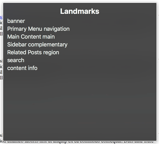
A thoughtful use of landmarks can give a website extra organization that will help people find information more easily. Beyond making the site more accessible, making decisions about using landmarks on a site can provide clarity about the true purpose of different elements on a site.
3. Every image needs an alt attribute
If an image is missing an alt (alternative text) attribute, screen readers will read the image file name. That can be very annoying for computer generated names like 201018acn300x450.jpeg.
If an alt attribute exists and has text in it, the text will be read. No need to include "Photo of" or "Image of", the screen reader will indicate that it is an image.
If an alt attribute exists and is empty, the screen reader will skip this image entirely. If the image is not content, is purely decorative, and not important for understanding content or functionality, an empty alt attribute can be a good strategy.
4. Role Attributes and Landmarks
As was mentioned earlier, screen readers allow people to navigate via landmarks. Here is an example landmarks menu from a site that uses a combination of landmark elements, role attributes, and aria-labels to create a clean, easily understandable landmarks menu.
Take a <nav> element for example, which would be used to define navigation element. The screen reader will note to the user by default that this is a navigation element. This can be taken a step further and provide an aria-label (<nav aria-label=”Primary Menu”>) which will tell the user that this is the Primary Menu navigation.
In the example screenshot above, the Sidebar, Related Posts, Social Share Links, and Search sections of the page are labelled to make them more easily discoverable. It makes the entire site easier to understand and navigate.
5. Avoid click event listeners on <div> elements
A common pattern for interactive sites is to make the website do something when a user clicks on an element. Click on this text or button, and the menu expands. This functionality is accomplished with Javascript by listening for click events, like this:
const interactiveElement = document.querySelector('div.className');
interactiveElement.addEventListener('click', doSomething());
For screen readers, listening for clicks on HTML div elements can be detrimental because divs convey no semantic information to screen readers.
Here are the problems:
- VoiceOver and other screen readers present them as a generic text element.
- Users will not be able to tell that they can click on the element.
- If a user is using their keyboard to navigate a page, they will never land on a
<div>because it is not focusable. The div will never receive focus, and their browser will skip over it. - Also, there is another menu in voiceover that shows all the interactive buttons on the page. A div with a click event will not show up in this button menu.
In short, <div>s are inaccessible to screen readers.
There are workarounds for making divs more accessible, but the fastest route is to just use the HTML <button> element. When the <button> element is listening for click events you get all the functionality screen readers and keyboard users need to use that element: the screen reader will tell the user it's a button, users can navigate directly to the button, and the button will have the same functionality with a mouse or a keyboard. The <button> element does a lot of the heavy lifting of making interactive elements accessible, so use them.
(Need help styling your buttons? Andy Bell's Button Pal is a great CSS resource!)
It's not too scary, right?
I hope you see from these 5 tips that starting on accessibility doesn't have to be scary. For the most part, accessibility is about doing the simple things the right way. We want to make the web easier to use and understand for everybody, no matter what.
When you get to the bottom of it, this is the core of web accessibility, and really the driving principle of the web in general: ensuring that anybody can access, use, and understand the information, regardless of the method they use to interact with the internet.
Want to dive deeper into building accessible websites? Join my free email course: 📨 Common accessibility mistakes and how to avoid them. 30 days, 10 lessons, 100% fun! 😀 Sign up here!